Embedded Catalog
Embed the integration catalog directly into your web app
If you want more control over how your Integration Catalog is presented, you can embed it into a web page or a web app.

Using Javascript
You can use Javascript to embed the integration catalog into your page or app.
Install the catalog with the xkit-catalog.js script:
<script src="https://<your-slug>.xkit.co/xkit-catalog.js"></script>
This script loads onto the page asynchronously, so if you're using this installation method, you'll want to wrap any calls to xkit with the xkit.ready callback function to make sure it's loaded first:
xkit.ready(() => xkit.login("some_user_token"))
You can also install the catalog with an npm package:
npm install @xkit-co/xkit-catalog.js
xkit-catalog.js exposes the same functions as xkit.js, so you can use that one script to both render the catalog and log your end users in, which you'll need to do in order for users to be able to install your integrations.
In your application or on your webpage, when you want the catalog to be available, call xkit.renderCatalog() with the element you want to render the catalog into. Make sure this element (with ID xkit-catalog in this example) is available in the DOM before calling xkit.renderCatalog.
const $el = document.getElementById("xkit-catalog")
xkit.renderCatalog($el, {
  hideTitle: true,
  rootPath: '/path/to/integrations/'
})
<body>
  <!-- ... -->
  <div id="xkit-catalog"></div>
  <!-- ... -->
</body>
Set the rootPath to the page you're rendering on
The catalog uses the
rootPathparameter to know when to render itself. Make sure you pass the path of the current page when rendering the catalog.
When you need to remove the catalog (e.g. because the user has navigated away from the page where it exists in your app) call the unmountCatalog function:
const $el = document.getElementById("xkit-catalog")
xkit.unmountCatalog($el)
Using React
If you're already using React on your web app and you want to include the Integration Catalog, you can do so. The entire Integration Catalog is exported as a single, self-contained React component.
First, install the Catalog via npm:
npm install @xkit-co/xkit-catalog-react.js
Then create your instance of Xkit and pass it to the Catalog component
import * as React from 'react'
import * as ReactDOM from 'react-dom'
import { App as XkitCatalog, createXkit } from '@xkit-co/xkit-catalog-react.js'

const xkit = createXkit("<your-slug>.xkit.co")

function MyApp () {
  return <XkitCatalog xkit={xkit} />
}
The Integration Catalog uses React Router, so if you're already using React Router, you should disable it to avoid conflicts by setting the inheritRouter prop to true.
If you're not using React Router, you may want to adjust the routerType to use what works best for your app.
Also, you can take a look at our sample React app to see how to use React components.
Next.js
If you're using Next.js, take a look at our sample Next.js app or our blog post to see how to use the React component with Server-side Rendering.
Customizing Appearance
In addition to the options available for customizing your catalog, xkit-catalog.js exposes a few other options to control how the catalog appears to your users.
Title and Search Bar
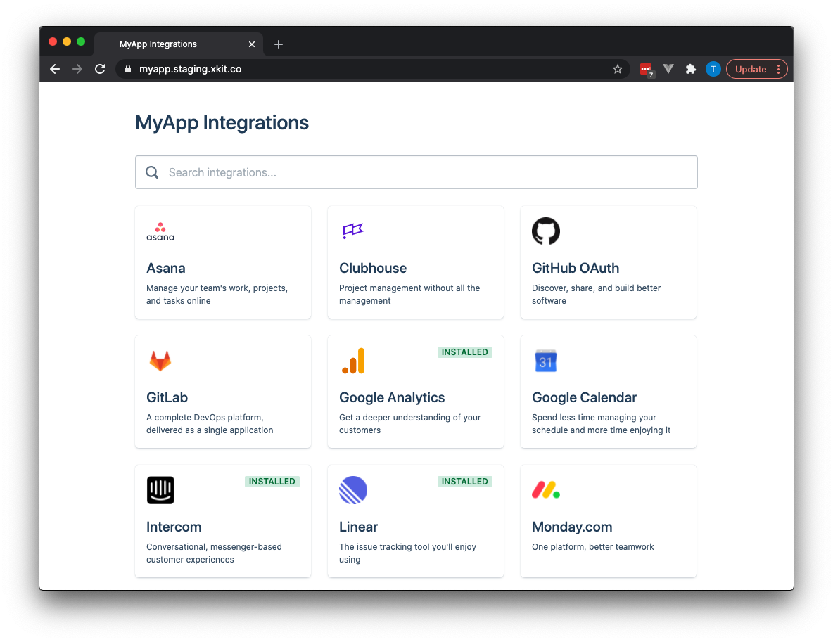
By default, the Catalog includes a title at the top based on the name of your application, something like "MyApp Integrations", as pictured below.
It also includes a search bar so that users can find integrations they are looking for quickly.

To change the title that appears in the catalog (without affecting your application name elsewhere), you can use the title option of renderCatalog (or the same parameter in the React component).
xkit.renderCatalog($el, {
  title: "My Integration Marketplace"
})
<XkitCatalog xkit={xkit} title="My Integration Marketplace" />
If you prefer to hide the title entirely, set the boolean option hideTitle to true. And to hide the search bar, use the boolean hideSearch.
xkit.renderCatalog($el, {
  hideTitle: true,
  hideSearch: true
})
<XkitCatalog xkit={xkit} hideTitle hideSearch />
Theme
You can specify a custom Theme for the integration catalog to make tweaks to its appearance to better embed with the rest of your app or website.
Below is a full example of a themed catalog:
Specifically, you can control:
Text
- Sizes: Use an object with keys ranging from
100to900(in whole hundreds) with a corresponding font size in pixels. - Fonts: Set the font family used in both the
display(i.e. titles and large text) andui(everything else) - Colors: Set the CSS color name or Hexadecimal color code for the
default,dark, andmutedtext in the catalog
We have two classes of buttons: primary (used for the primary page action, like the "Install" button), and default (used for everything else).
Both can have a custom textColor (CSS color name or Hexadecimal code) and background (Color or Gradient).
The boxes on the main catalog page which contain links to the details for an individual connector we refer to as "Cards". With cards, you can control:
- Padding: the padding in pixels between the edge of the card and its content
- Elevation: an integer from 0 to 3 representing the size of the drop shadow on the card, or its "elevation" above the page
- Hover Elevation: the same as elevation, but only appearing on hover
- Border radius: the border radius, in pixels, of the cards.
More options
If you need more customization than what is available in the theme, please Contact Support for assistance.
URL
If you're using a routerType other than memory, when a user clicks on a connector, it will navigate to a page dedicated to that connector which will be reflected in the URL.
By default, that path is ${rootPath}/connectors/${connectorSlug}. You can customize the connectors portion of that URL by specifying the connectorsPath. A popular option is to remove it entirely, which looks like this:
xkit.renderCatalog($el, {
  rootPath: '/integrations',
  connectorsPath: '/'
})
The result would be a path like: https://example.com/integrations/asana.
Filtering Connectors
If you have some connectors that should appear only to certain users, you can filter them from view at runtime. Specify a Catalog Filter which takes as a parameter the Connector and returns a boolean. This can be useful for basic feature flagging for a new connector, but not that while it will not be visible to the user, they will still be able to connect it.
If you need more advanced filtering behavior, please Contact Support.
Settings for integrations
Frequently, integrations that you offer to your users will need some kind of configuration or settings available to control how the integration behaves. Examples might include picking a Trello board to sync, or choosing a frequency with which to poll some external service.
To facilitate that configuration within the embedded catalog, we have the settings function.
The settings function allows you to specify fields to be rendered directly into the embedded catalog for a particular connection. It takes as its first parameter the Connection to be configured. You return a list of fields, which are then presented to the user.
When the user clicks the "Save" button, your settings function is called again, this time with a second parameter that is the list of fields you provided with their value modified to reflect the user's input.
It is up to your application to persist or otherwise take action on the user input. If your function throws an error, we'll present that error to the user. After you have taken action, you must return the fields back from the function (either directly or as the resolution of a Promise).
We currently support four types of fields:
- Text: a single line text input
- Select: select a single item from a list
- Select Multiple: select multiple items from a list
- Switch: choose a binary on/off, true/false for a field
Here's an example:
xkit.renderCatalog({
  /* ... */
  settings: (connection, fieldsToSave) => {
    // Only show settings for the Intercom connector
    if (connection.connector.slug === 'intercom') {
      if (!fieldsToSave || !fieldsToSave.length) {
        // provide the initial fields to render
        return [
          {
            type: 'text',
            name: 'first_name',
            label: 'First Name'
          },
          {
            type: 'select',
            name: 'lyric',
            label: 'Favorite Lyric',
            value: 'hello',
            options: ['hello', 'darkness', 'my', 'old', 'friend']
          }
        ]
      }
      // save this to your backend, and return the updated fields
      return saveIntercomSettings(fields)
    }
  }
})
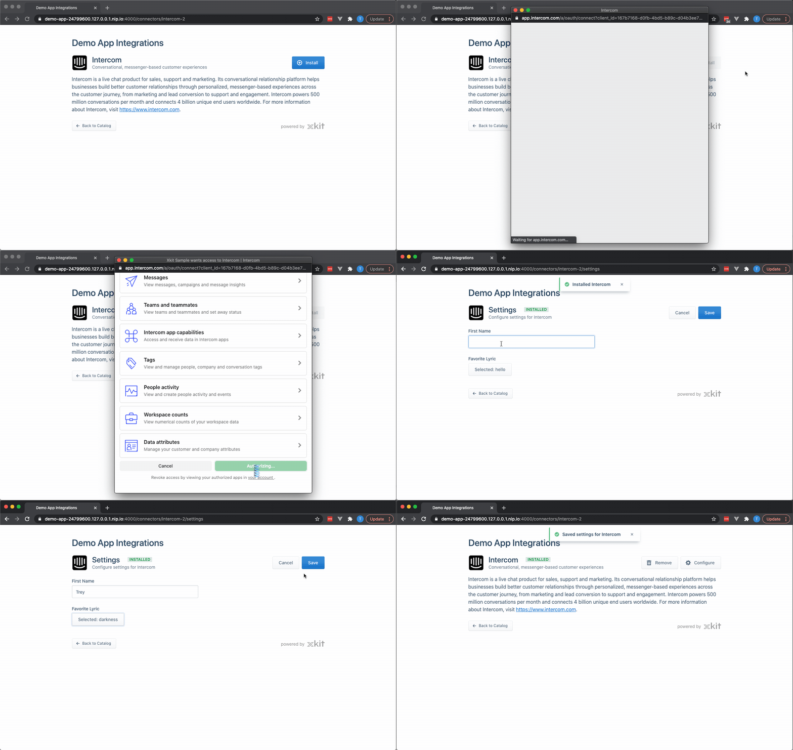
The settings screen will appear automatically after a user has authorized/installed an application:

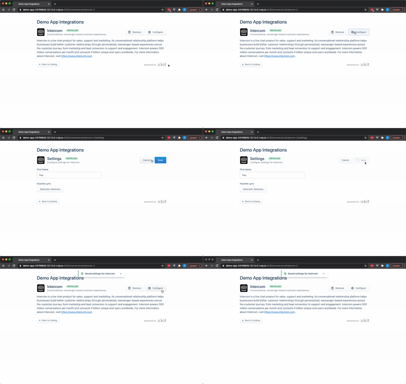
And as long as the result of your settings function is a non-empty array, the user will have a "Configure" button available to change their settings.

If you need additional field types that we don't have listed here, or if you have more advanced configuration behavior, please Contact Support so we can assist.
Updated over 4 years ago
